I haven’t done one of these in a couple of years, so let’s have some fun!
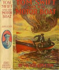
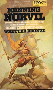
Here’s a half-dozen covers from my more obscure posts. Which ones would you take a look at based on that cover? Which ones work best? Are any of them bad covers, per se? Comments are open!


Global Public Square. I like the simplicity of it. However, I will say that seeing them shrunk down is different than seeing them book size.
True enough. The book publishers I’ve heard talking about the business say that the current trend is try to make the cover look good at the relatively tiny size of Amazon thumbnails.