I haven’t had an open thread in a while, so here we go.
One of the things readers do a lot at bookstores, libraries and online is judge books by their covers. Yes, despite the old saying.
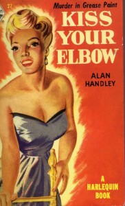
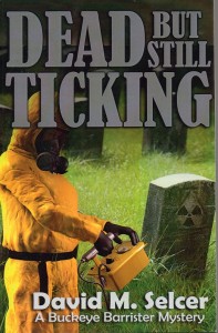
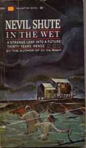
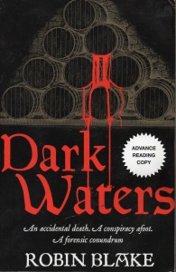
What I am going to do is post six covers of books I’ve reviewed, choosing them from the more obscure posts. Look at them and see which you find most interesting, and tell me what you think the covers say about the books.
You can also talk about what makes you like a cover, or makes you skip right over a book once you see the front cover.


Thank you for the visual exercise! By the cover alone, for me, #1 would be “After the Vikings.” With its crisp, clear illustration, I might expect crisp, clear writing. #2 would be “Kiss Your Elbow,” though I suspect I’d like the retro visual better than the possible retro story. And #3 would be “Journeyman Wizard,” which feels calming and soothing with these colors. “Dark Waters” and “Dead but still Ticking” are probably the ones I’d choose first by subject matter, but I do not care for those covers! An interesting exercise.
“Kiss Your Elbow” is indeed retro; a reprint from the late 1940s, a year or two before Harlequin converted to publishing all romance all the time.
Unfortunately, I’m guilty of choosing a book by its cover. If I’m just browsing at the library or in a bookstore, I pick books up based on the cover. When I’m online, I click on books based on their covers.
Sometimes, this ‘method’ really disappoints me. I left reading a sucky book just because it happens to have a pretty cover.
Other times, I get lucky and I get a good one. I’d like to think that a good cover means that an author put a lot of work into their book and cares enough to get a good cover.
Interesting and thought-invoking post!
Most of us do that, I think, although I am often intrigued by books that have very battered covers that are nearly worn off, as well. It means someone read the book repeatedly before it wound up at the used bookstore or garage sale.
Welcome to the blog!
I like the simplicity of the Dark Waters cover. Also, the tagline under the title peaked my interest.
It’s a good color balance, I think (the white starburst would not be on the finished cover.)
Forgot to mention the graphic treatment on the cover of Dark Waters appealed to me.
Actually they all appeal to me, for different reasons, but if I had to pick one, I like the messy, dark struggle of ‘In The Wet’.
It’s a scene that actually happens in the books, too.
Journeyman Wizard, hands down.
Okay, so I’m a sucker for wizard books. Not to mention books for younger readers (which, to judge by this book its cover, it looks like).
I like the cover so much I’m off to my library’s website to see if I can borrow that title! Or — ooh — get it on audio…
Yes, this is young adult. It’s the second in a series–which ended with the second book. Don’t know if it’s available on audio.
Journeyman Wizard would be the only book Id’d consider out of these. It has a medieval feel to it and a touch of magic, but I’d probably make it more magical if it was up to me.
It’s set in one of those worlds where magic is he province of a relative minority of well-educated people. You have to have both talent and ttraining to do anything useful.
Fun post topic. I find Dark Waters most visualizing appealing and I’d expect a taut thriller. Love the vintage Kiss image, but I’d be suspicious that the storyline might be too retro for my liking.
I’m always interested in seeing the different covers a hardback gets and then it’s paperback. And I’d so love to understand the real complexities of publishing contracts – if I were an author I’d really want to get to decide on the cover art for my book.
It can be a tradeoff–Small press or self-publishing gives you much more control over the cover image (and many other things) but shrinks the budget for said cover. One book coming up soon for review has a picture of an odd cactus because the writer photographed it on vacation. Nothing to do with the subject of the book (cybersecurity) at all.
i too liked the Dark Waters cover. However, I think it was the lines “an accidental death, a conspiracy afoot, a forensic conundrum” – what possibly could be a forensic conundrum? I’m stumped, so I’d probably have to read it to see what that meant!
Text on the cover is important too. I think it’s referring to the town coroner trying to determine if a person died of natural causes or poison, without the benfit of modern medical techniques.